
Student Outcome Dashboards: What Schools Should Measure — and What They Should Never Overclaim
Dashboards can help schools review implementation and student evidence, but neat percentages should not outrun the quality of the underlying data.

Research note: time-sensitive claims and source links were reviewed on . Primary sources are listed at the end of the article where available.
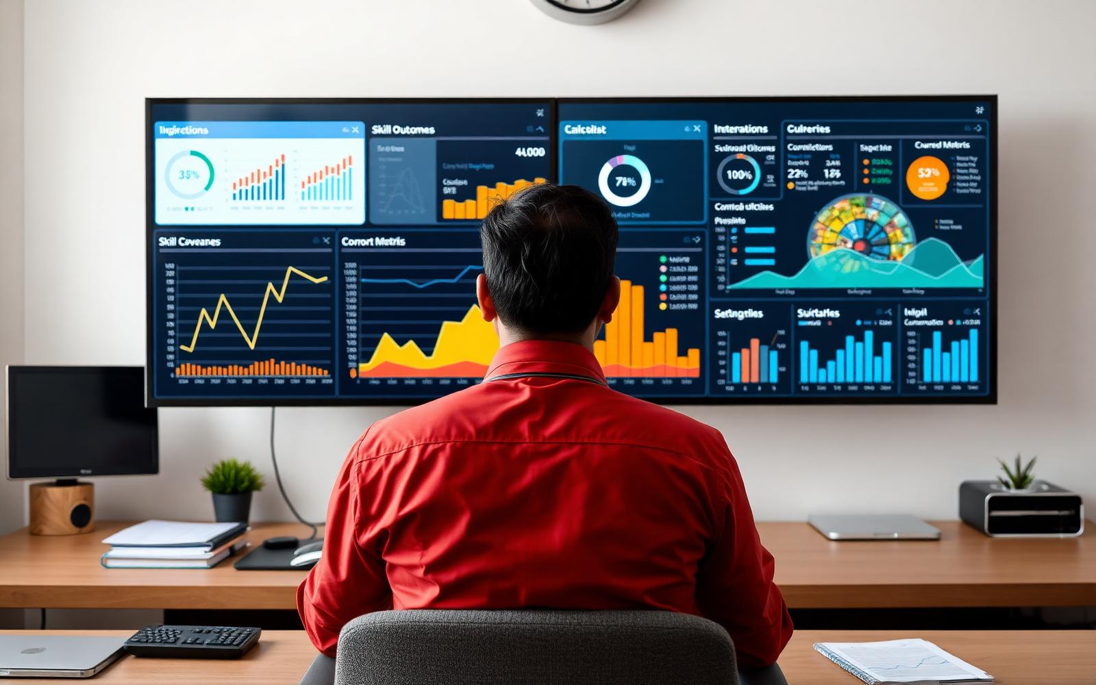
Dashboards are persuasive because they make complexity look settled. Green arrows rise, percentages improve and schools feel they can finally 'see' student development. The risk is that the interface can become more confident than the evidence.
Separate participation, output and outcome
- Participation: who attended or completed an activity.
- Output: what students produced — projects, reflections, presentations or portfolios.
- Outcome: what changed in knowledge, behaviour, capability or decision quality.
These are related but not interchangeable. A 92% completion rate is not a 92% improvement in communication. A portfolio count is not proof of portfolio quality.
Show the evidence behind the number
Where a dashboard uses a rubric score, make the rubric accessible. Where it reports career-direction signals, show the questions or artefacts that inform the signal. Where data is illustrative, label it clearly rather than allowing a screenshot to become an accidental outcome claim.
Keep implementation metrics beside student metrics
Delivery matters. Record sessions completed, teacher participation, missing data and timetable interruptions. A school reviewing a pilot needs to know whether a weak result reflects the programme design, implementation quality or measurement itself.
Never imply causation from a simple before-and-after chart
Students change for many reasons. Unless the study design supports a causal claim, describe observed change rather than claiming the programme caused it. That restraint increases long-term trust.
A principal needs drill-down, not decoration
Every headline metric should lead somewhere. If a dashboard says '68% of students completed portfolio-quality projects,' the principal should be able to see the definition of portfolio-quality, the number of students included, the rubric or review method and a small sample of appropriately protected evidence. Otherwise the percentage is difficult to challenge or learn from.
The same applies to trend lines. Show the date range, cohort and whether the measure changed. A dashboard should reduce ambiguity, not hide methodology behind polished visual design.
Design different views for different users
- Student: my evidence, feedback and next action.
- Teacher: class patterns and students who may need support.
- Counsellor: pathway questions, career exploration and follow-up.
- Leadership: implementation, participation and aggregate outcome evidence.
- Parent: understandable progress with enough context to avoid overinterpretation.
Not every user should see every field. Role-based access and data minimisation are part of product quality, especially when the information concerns minors.
A dashboard should make uncertainty visible
Good dashboards can show missing data, small samples and low-confidence interpretation instead of forcing every cell to look complete. If only 18 students submitted comparable artefacts, the interface should say so. If a metric is based on self-report, label it. If a rubric changed mid-year, the trend should not quietly continue as if nothing happened.
This kind of design may look less impressive in a sales screenshot, but it is far more useful to a principal making decisions. OnliGrow should treat transparency as a product feature rather than something added in fine print.
Sources and further reading
Want to test this in your school?
OnliGrow is being built to turn these ideas into a structured school program. A useful pilot starts with your context, not a standard promise.
Discuss a pilot